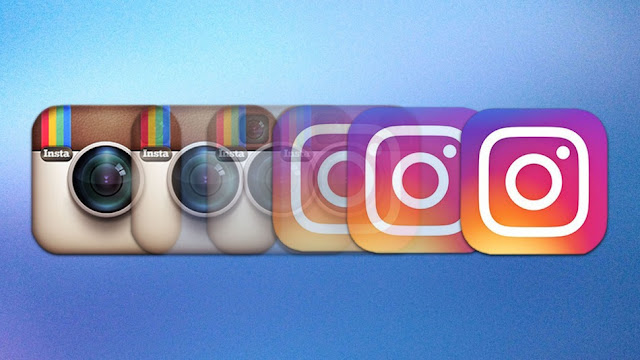
Why Instagram’s new logo sucks
A logo is to a business as your face is to
you. It is how you are recognised. It reflects your personality, or in case of
your business, your values and principles. It is also the most powerful
marketing tool known.
Logo design establishes your identity.
If you're looking to establish your identity or business with an amazing logo design, contact The Computer Guyz in Cape Town or Centurion. We can create professional, eye-catching designs that promote your brand or business and connect with your target audience.
If you're looking to establish your identity or business with an amazing logo design, contact The Computer Guyz in Cape Town or Centurion. We can create professional, eye-catching designs that promote your brand or business and connect with your target audience.
Well, last week Instagram revealed their
brand new – very different – logo. Surprisingly most people hate the new icon,
and if you disagree, you’re wrong!
The iconic instant camera icon — with a
glass lens, viewfinder, brown leather wrap and rainbow, alongside the word
"Insta" in the corner is completely gone.
You’ve probably already seen it by now, but
the old logo has been replaced with a simple glyph in the shape of a camera
outlined in white and set on top of a yellow / orange / pink / purple gradient.
Yes, it is definitely different! And once Instagram
junkies saw it, boy did they react! In a statement, Instagram said that they
wanted to make sure that the updated look was still recognizable. However, I think
the issue is that it is too minimal, plus why fix something that wasn’t broken?
Although the old icon could have been
updated just a bit, there was just something familiar, relatable and very
calming about seeing it on your home screen and then tapping on it.
Whether this was because of the warm brown
colour or the old-school camera lens, the logo just didn’t feel like it was
ever in your face. However, the new icon does. It is just screaming for
attention! The new icons loud design was intentionally done though, Instagram’s
designers didn’t want to get lumped in with the other camera apps. My opinion
is that they should’ve just updated the logo, but kept the same, original
design.
If you analyse your phone’s main home
screen for a minute, you’ll probably notice that the most popular apps you use
are green (Phone, WhatsApp, Messages, Spotify) or blue (Facebook, Mail,
Twitter, Messenger). The only app that now sticks out like a sore thumb is the
new Instagram logo!
 The logo is not the only thing that has
changed. The user interface is new too. It has been stripped of almost all its
colour and been replaced with black, with red notification icons instead of
orange.
They may have been going for the
minimalistic look, but I feel that it looks terribly bland now. There is
nothing distinctive about it anymore, it’s like it has become as generic as the
other hundreds of photo-editing apps out there, and in design that’s not a good
thing at all!
Change is hard and I guess we will just
have to deal with it and get used to the new Instagram logo over time. But for
now, you’re allowed to hate the new icon with a passion!


Comments
Post a Comment