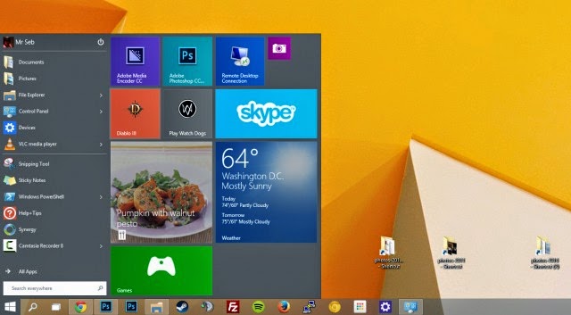
Windows 10 features – Start Menu
Windows 10 is still a
work in progress, but the most noticeable addition is the return of the Start
Menu, and many of us are wondering if it will be as horrible and bizarre as the
Windows 8 Start Screen.
 Luckily for us it’s
clear to see in the new Windows 10 preview that Microsoft is taking a better
direction, the new Start Menu mixes desktop apps with the new modern Windows 8
apps by surfacing Live Tiles. The best part is, if they’re annoying you – you can
turn them off! Or if you’d like, keep them around if you want to quickly glance
at the weather, news or any other information.
Microsoft has added a full
screen option which lets you expand the menu to make it look similar to the
Start Screen found in Windows 8. There is a big difference though; the taskbar
is present at all times! This is a much needed improvement to make navigation
between apps easier. There are also some
small changes that help with switching between apps:
-
Microsoft
is bringing back the flip 3D feature to present a view of all apps running on a
system.
-
When you
swipe in from the left on a large tablet or a 2-in-1 will activate the new apps
view.
-
It’s
easier to use a mouse and keyboard or touch to select the app you want.
If you think back to
Windows 8 or if you have Windows 8 at the moment, you have to navigate into the
corners and activate a side menu with your mouse, and it is rather irritating
the more you use it.
The navigation changes
extend to the Charms menu – it is gone and has now been replace by a
notification centre is you swipe from the right. If you move your mouse into the
corners on the right, it does nothing, but you can access the notification
centre from the system tray in the lower right side. To be honest this change
is quite strange and lacks convenient access to settings like WiFi or display
brightness for laptops and tablets, but Microsoft is balancing that with quick
toggles for settings. This particular area still needs some improvement, but
either way, getting rid of the awkward Charms menu is a good thing.
All in all the Start
menu is much better suited for all devices whether they are touchscreen or not,
and its good to see a joined Start menu design instead of it being split into a
Start menu and Start screen.
For all your IT needs and services, contact The Computer Guyz in Cape Town or Centurion. We can offer you a wide variety of options, from IT support and graphic design to just some friendly advice.
Written By: Christine Romans
CopyWriter at The Computer Guyz Cape Town
CopyWriter at The Computer Guyz Cape Town


Comments
Post a Comment